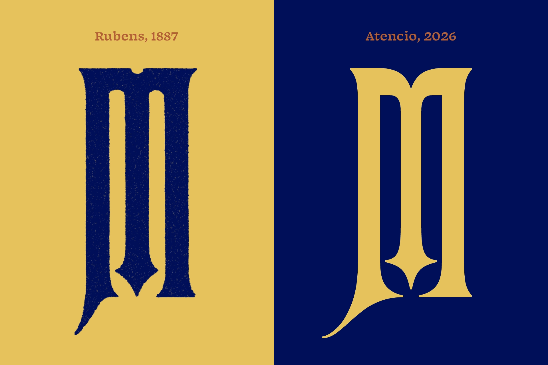
When we started working on Atencio, we prioritized the M rather than the typical H and O, as the M defines the style of Rubens. Our initial sketches were nearly identical to the original wood type, which led us to ask what the point was of making it all over again. Was our goal to merely create a better digital replica, or did we have more to say?
From this side-by-side comparison, you can see where this question led us.
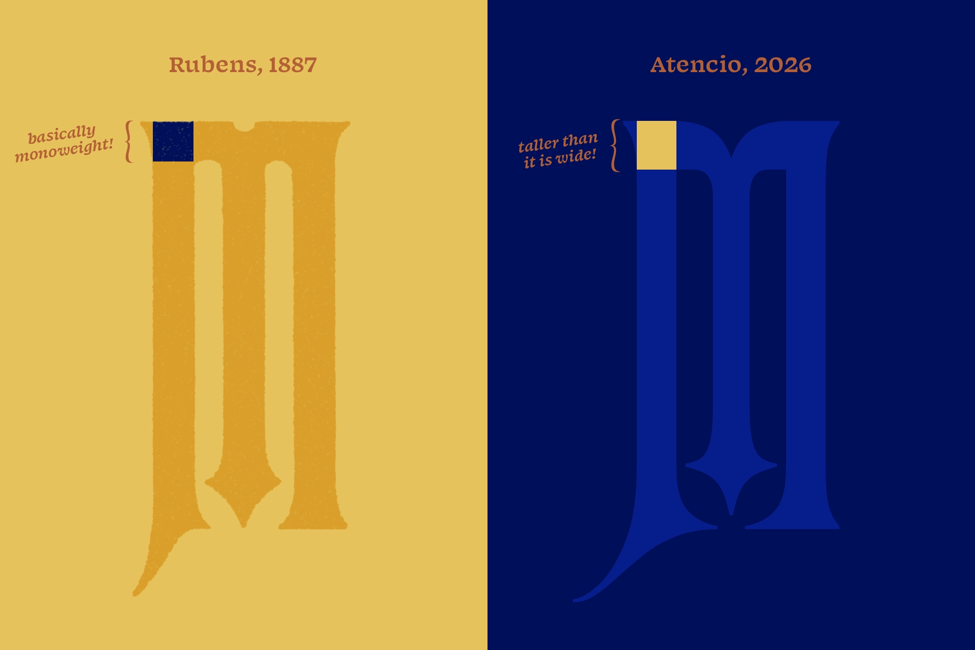
Though Atencio roughly correlates to the original weight of Rubens, the weight of its horizontals is increased. Already a narrow style, this choice exaggerates its verticality, as if the letter was stretched, giving it some personality.
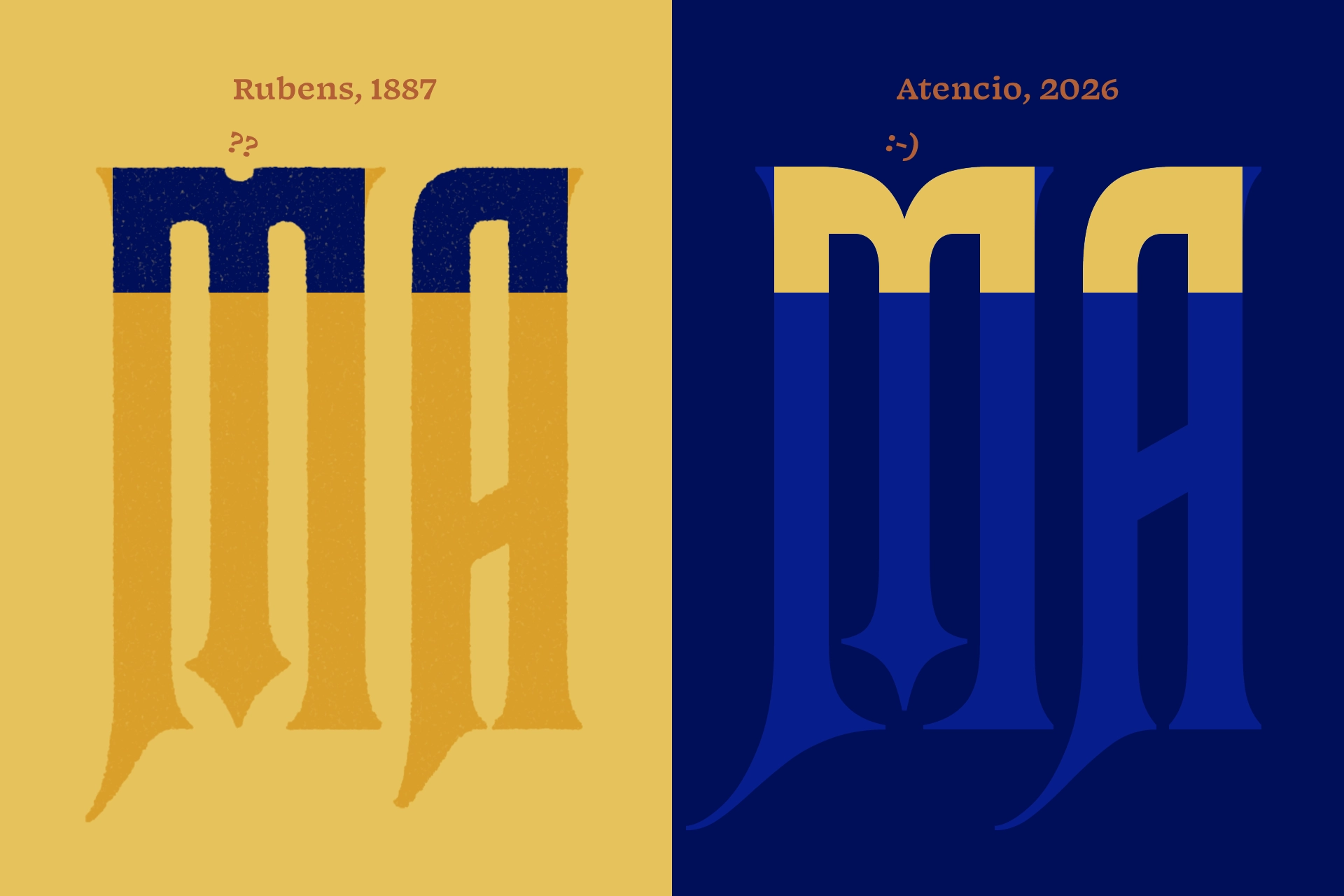
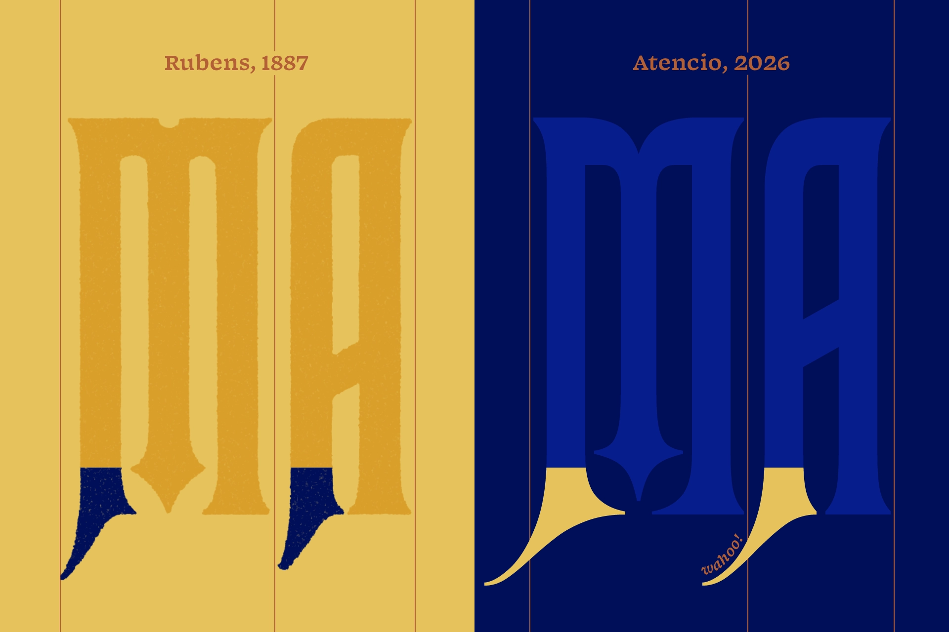
The Rubens M fully rounds its interior counters despite the exterior’s straight edges. Looking at the A, it becomes apparent that not all interior counters are rounded, but that they match their corresponding exterior corners, making the M a little bit of a rule-breaker. The curious circular cutout at the top of the Rubens M made its way into digitizations, though some have used a triangular cutout instead. The M in Atencio curves downward into the center stroke, with matching interior rounded corners.
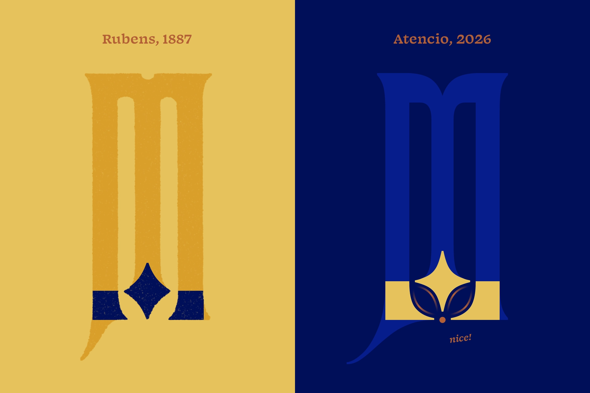
That stroke terminates in a unique attribute of Rubens, a tapered diamond shape. For Atencio, the counters are opened slightly to allow for a more exaggerated taper, keeping the weight of the diamond, while increasing its appeal. The diamond slopes relate more closely to the interior serifs, which together create a balanced leaf shape in the negative space. In the lightest weight, the two serifs and bottommost point of the diamond are equidistant from the center baseline of the character.
The swashes at the bottom of letters in Rubens were limited by the physicality of wood type, only extending downward, but Atencio’s swashes are able to extend beyond the character bounds. These swashes also contextually disappear to avoid collisions with other swashes and descenders.
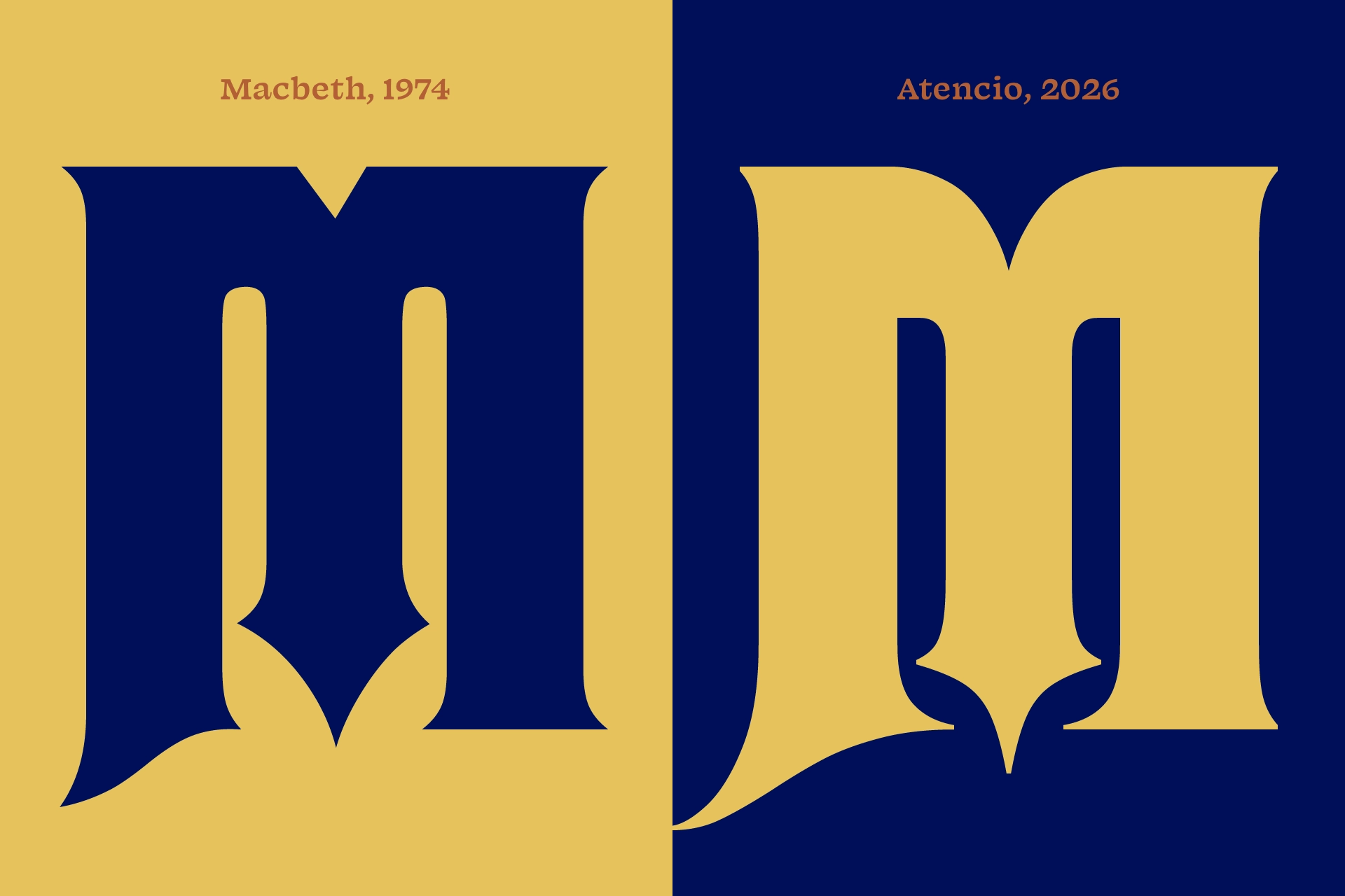
Rubens never had a black weight, but a similar style called Othello was later revised into something called Macbeth in 1974. The bottommost point of the Macbeth diamond extends a little further than the baseline, but perhaps leaves a little too much negative space at the bottom, so Atencio’s dips further to match the weight of the counters.
Atencio is available now as a work-in-progress. It includes four weights plus a variable font to smoothly transition between the two extremes. The price will increase as the font is developed. Licensees will get free updates. Purchasing a license now ensures you’re getting it at the cheapest price it will ever be and supports future development.